Most Indian living rooms start from the same place: builder-beige or off-white walls, a darkish wood-toned floor, and furniture you can't easily change. The colour decision, then, isn't about repainting — it's about which scheme you build on top of that base with the soft layers you can swap: cushions, rug and throw. Here are five palettes that reliably work in Indian rooms, and how to assemble each.
How to read a palette
Every working scheme is really three roles: a base (your walls and largest pieces), a mid-tone (rug, upholstery), and an accent (cushions, throw — the colour you actually notice). Get the proportions right — lots of base, a calm mid-tone, a little accent — and almost any palette holds together.
1. Warm neutral (the safe, expensive-looking default)
Cream and oat base, a stone or greige rug, and accents in camel, soft brown and walnut. No bright colours at all — depth comes from layering textures rather than hues. This is the most forgiving scheme and the one that reads most "premium" with the least effort. Add one muted warm accent (terracotta or ochre) in a single cushion if you want a lift.
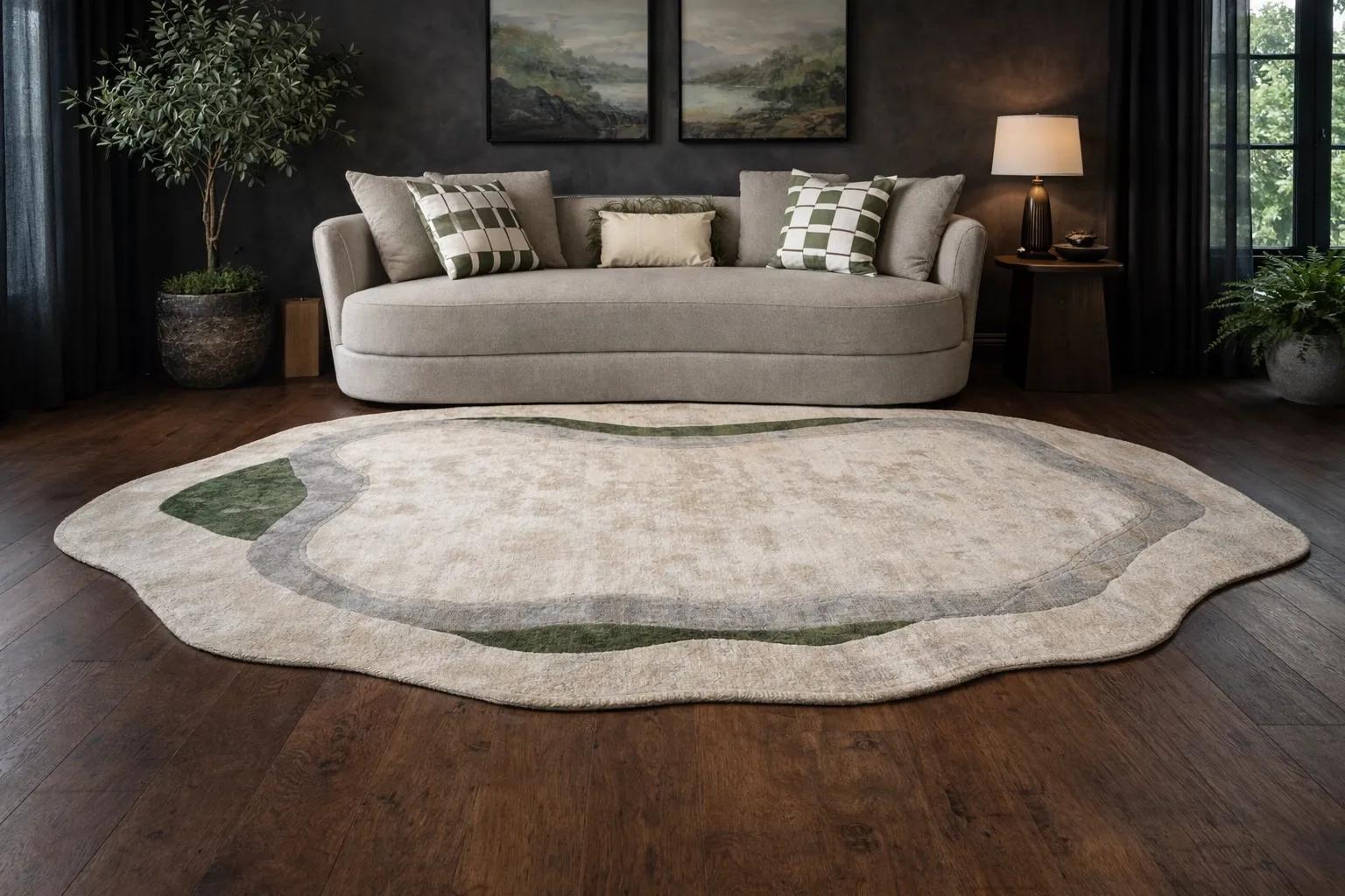
2. Quiet luxury (tonal and tactile)
A close cousin of warm neutral but even more disciplined: warm white, oat, stone and soft charcoal, with the richness carried entirely by material and texture — slub linen, wool-blend, low-pile rug — not by colour. One restrained accent at most. The room should reward touch more than it surprises the eye. Avoid stark white, which glares in Indian light.
3. Japandi calm (warm minimal)
Pale, warm neutrals with natural wood, undyed textiles and near-white embroidery, lifted by a single muted earth tone — clay, sage or smoke. The discipline is restraint: empty space is part of the scheme. Japandi suits compact flats because the visual quiet makes rooms feel larger. White-on-white textured cushions and an undyed throw do most of the work.
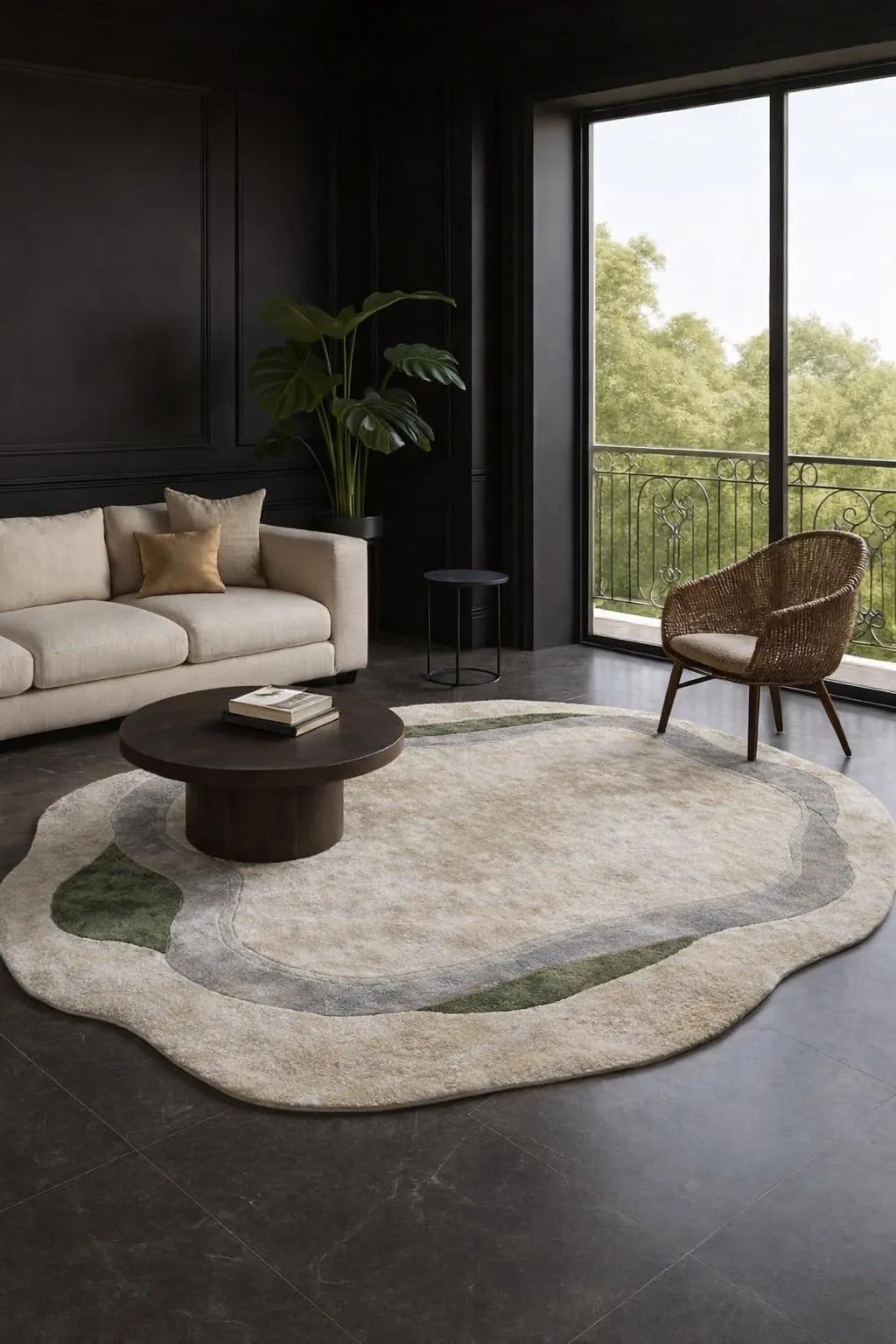
4. Italian warm (rich but grounded)
A warmer, slightly bolder neutral base — sand, taupe — with deeper accents drawn from the Italian palette: madder red, indigo, walnut. One botanical-print cushion against solid linen, a rug with a warm ground. This scheme has more colour confidence than the neutrals above while staying sophisticated. Keep the bright notes few and let the warm base hold them.
5. Cool contrast (for tan wood or leather)
If your floor or sofa runs warm — tan leather, honey-toned wood — set it against its complement: a base of warm white with accents in muted blue, teal, sage or charcoal. A dusty-blue cushion against cognac leather, a sage throw, a rug with a cool grey note. The cool accents make the warm pieces sing, which is why this is the classic pairing for a leather-sofa room.
Building any of them, in order
Pick the base — usually your existing walls; choose warm whites and oat tones over stark white.
Set a calm mid-tone — a low-pile rug in a quiet colour gathers the room without competing.
Add the accent in the cushions — one print, one texture, one solid, in your chosen palette.
Repeat the accent once — in the throw or a rug thread — so the eye reads the scheme as deliberate.
The two rules that save every palette
Repeat, don't scatter. One accent colour appearing two or three times looks designed; five different accents look accidental.
Let texture carry the quiet schemes. The more restrained the colour, the more the room depends on tactile materials — linen, wool, low pile — to feel warm rather than bare.
You don't need to commit your walls or furniture to a colour scheme — only your soft layers, which you can change as your taste does. SOISU curates cushions, rugs and throws across exactly these vocabularies — Italian, Scandinavian and Japandi — in honest materials sized for Indian homes, so you can build any of these palettes one swappable layer at a time.