Vaastu colours for the living room are one of the most searched-for subjects in Indian interiors, and also one of the most poorly explained. Most advice arrives as a list of rules with no reasoning attached. We would rather treat Vaastu Shastra the way we treat any design tradition that has survived several thousand years: as a body of accumulated observation about light, orientation and how rooms make people feel. Read that way, its colour guidance overlaps remarkably well with modern colour psychology — and it becomes something you can actually use when choosing a rug or a set of cushion covers.
How Vaastu thinks about the living room
In the Vaastu framework, every direction of the house is associated with an element and a quality. The north-east is linked to water and clarity; the south-east to fire and energy; the south-west to earth and stability; the north-west to air and movement. The living room — traditionally placed in the north or east of the home — is the room of arrival and gathering, so its recommended palette leans towards colours that read as open, light and welcoming.
Strip away the metaphysics and the logic still holds. A north- or east-facing room in India receives cooler, gentler light for most of the day. Pale, low-saturation colours amplify that light; heavy, dark colours absorb it. The tradition and the physics arrive at the same answer.
The direction-wise palette, in plain terms
Use the wall your main seating faces, or the direction the room sits in within the floor plan, as your starting point.
Direction · Vaastu association · Recommended colours · Reads as North · Water, prosperity · Soft greens, aqua, ivory · Fresh, calm East · Sun, beginnings · Whites, pale yellows, light wood tones · Optimistic, airy North-east · Clarity · Off-white, pale blue · Quiet, meditative South-east · Fire · Warm accents — terracotta, rust, coral, used sparingly · Energetic South-west · Earth · Beige, taupe, mud browns, muted peach · Grounded, settled North-west · Air · Greys, off-whites, silver-toned neutrals · Light, sociable
Two things are worth noticing. First, the base colours Vaastu recommends — ivory, beige, pale green, soft grey — are essentially the Scandinavian and Japandi palette. Second, the strong colours appear only as accents. That is sound design advice in any tradition.
Translating walls into textiles
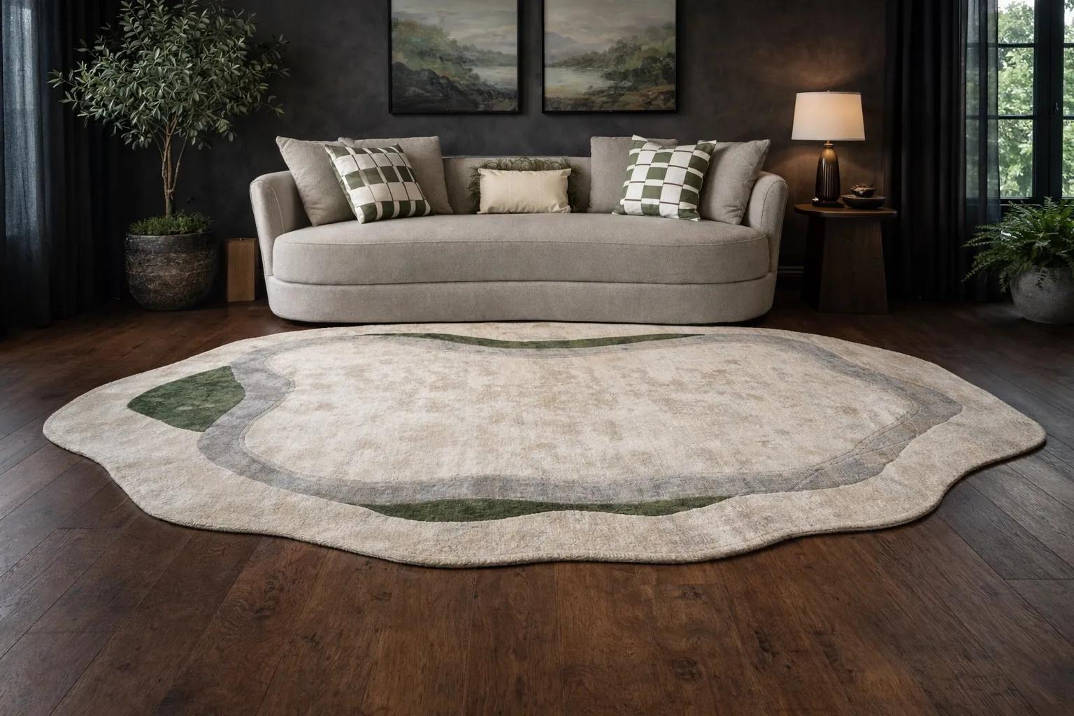
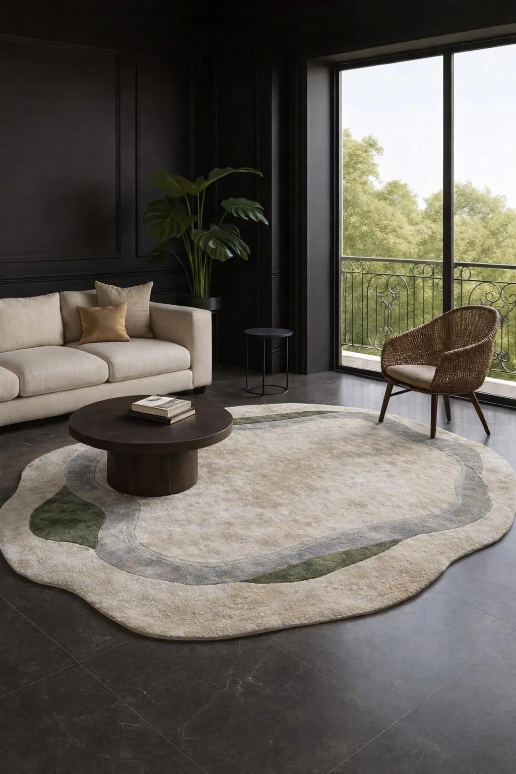
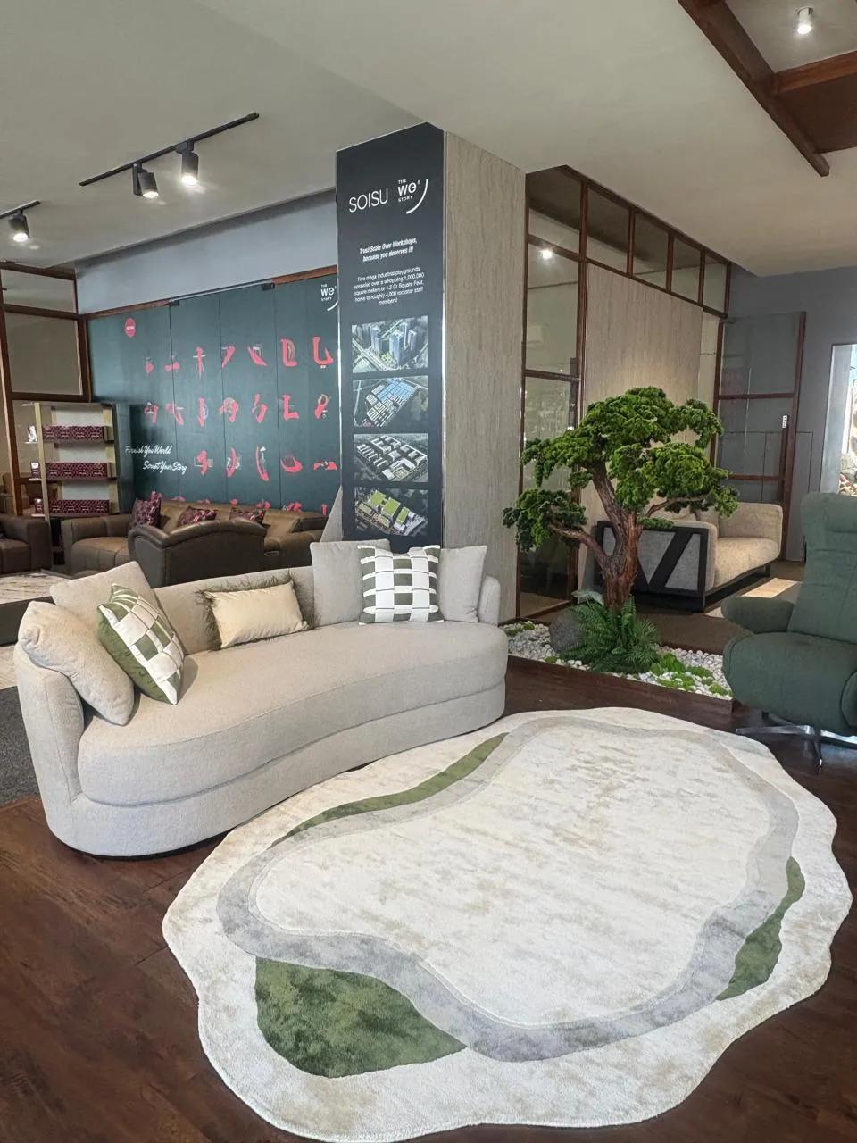
Repainting is a commitment; textiles are not. The simplest way to bring a living room into line with a direction-wise palette is to keep the walls neutral and let cushions, rugs and throws carry the colour.
North-facing rooms. A sage or eucalyptus-green cushion cover against an ivory sofa, with a natural jute or wool rug underfoot. Green in the north is among the most consistently recommended pairings in Vaastu texts, and it happens to be the easiest colour to live with.
East-facing rooms. Stay tonal — oat, bone, pale mustard. A handloom cotton throw in butter yellow catches the morning light without shouting.
South-east corners. This is where a single rust or terracotta cushion earns its place. One or two pieces, not a set of six; fire colours work as punctuation, not paragraph.
South-west rooms. Layer warm neutrals in different textures — a chunky bouclé cushion, a flat-weave rug in taupe, a brown-striped throw. Depth comes from texture, not from adding more colour.
Colours the tradition asks you to limit
Vaastu is consistently cautious about large fields of black, deep red and very dark grey in the living room. You do not need to treat this as superstition; the practical reading is straightforward. Dark, saturated colours shrink a room visually, absorb light that Indian flats — particularly those with deep balconies and grilled windows — can rarely spare, and raise the perceived temperature of a space that is warm for most of the year.
If you love charcoal or wine, use them where Vaastu itself permits accents: a cushion, a border on a rug, the binding of a throw. A 60-30-10 split — 60 per cent light neutral, 30 per cent mid-tone, 10 per cent deep accent — satisfies both the tradition and the eye.
A note on materials
Vaastu literature shows a clear preference for natural materials — cotton, wool, jute, clay — over synthetic ones, on the grounds that they belong to the elements the directions represent. Here, again, the old advice and the practical one agree. Natural-fibre textiles breathe better in Indian heat, take dye in softer, more complex tones, and age rather than degrade. A wool-blend rug or a soft cotton cushion cover will sit more comfortably in any of the palettes above than a shiny polyester equivalent in nominally the same colour.
The takeaway
Identify your living room's primary direction, choose a light neutral base, and add the direction's colour through two or three textile pieces rather than paint. North leans green, east leans pale yellow, south-west leans earth browns, and strong reds stay small. Whether you read it as Vaastu or simply as colour sense for Indian light, the room will feel calmer — and that, in the end, is what both traditions are after.