There's a moment every neutral room reaches where, despite tasteful colours and decent furniture, it falls flat — calm, yes, but a little lifeless, like a photo with the saturation turned down. The fix is almost never more colour. It's more texture. When you mute the palette, touch has to do the work the eye usually does, and a room built on a single smooth texture has nothing for the eye to rest on. Here's how to layer texture so a quiet room feels rich rather than bare.
Why texture matters more in neutral rooms
In a colourful room, contrast comes from hues bouncing off each other. In a neutral or quiet-luxury room, you've removed that contrast deliberately — so the depth has to come from somewhere else. That somewhere is the interplay of surfaces: matte against sheen, rough against smooth, soft against structured. Texture is what makes oat, stone and cream read as layered and expensive rather than flat and beige.
The texture families to mix
Think of textures in a few families and aim to include several:
Smooth & matte — fine cotton, percale, a flat-woven rug.
Slubby & irregular — slub linen, raw-edged weaves; the lived-in, characterful surfaces.
Soft & plush — wool-blend throws, a higher-pile rug, velvet.
Structured & nubby — bouclé, basketweave, embroidery, knit.
Hard & natural — wood, cane, stone, ceramic (the furniture and objects).
A room that mixes three or four of these reads layered; a room stuck in one (all smooth, or all plush) reads flat.
The method: vary three things
To layer texture deliberately, vary three properties across your soft furnishings:
Weave — pair a smooth cotton with a slubby linen and a nubby bouclé. Same colour, different surfaces.
Pile — set a low-pile rug against a plush throw, or a flat cushion against a textured one.
Finish — mix matte (linen, wool) with the occasional sheen (a silk-touch cushion, a leather sofa). The contrast of matte-against-sheen is what stops a room looking uniform.
Where to layer, room by room
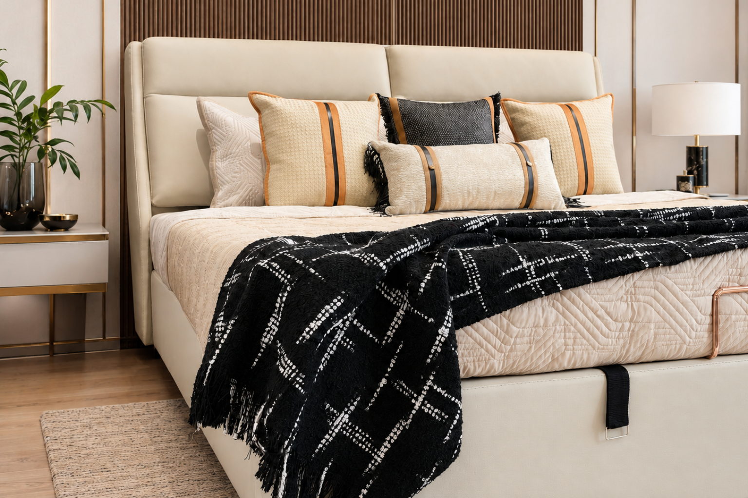
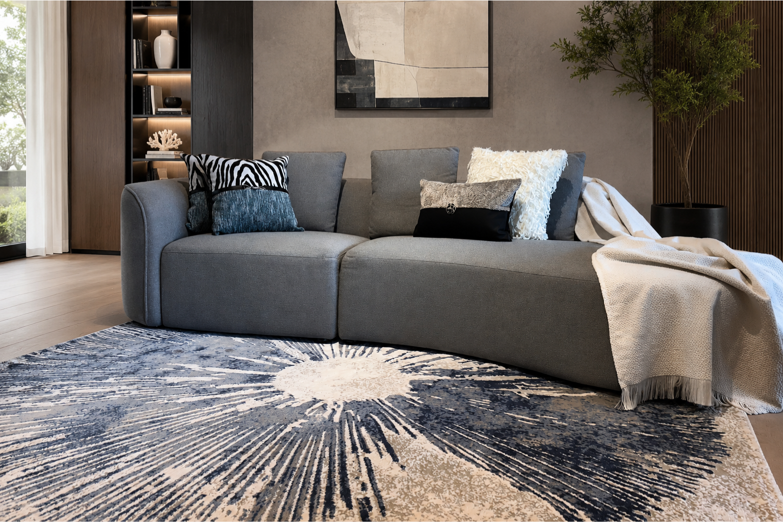
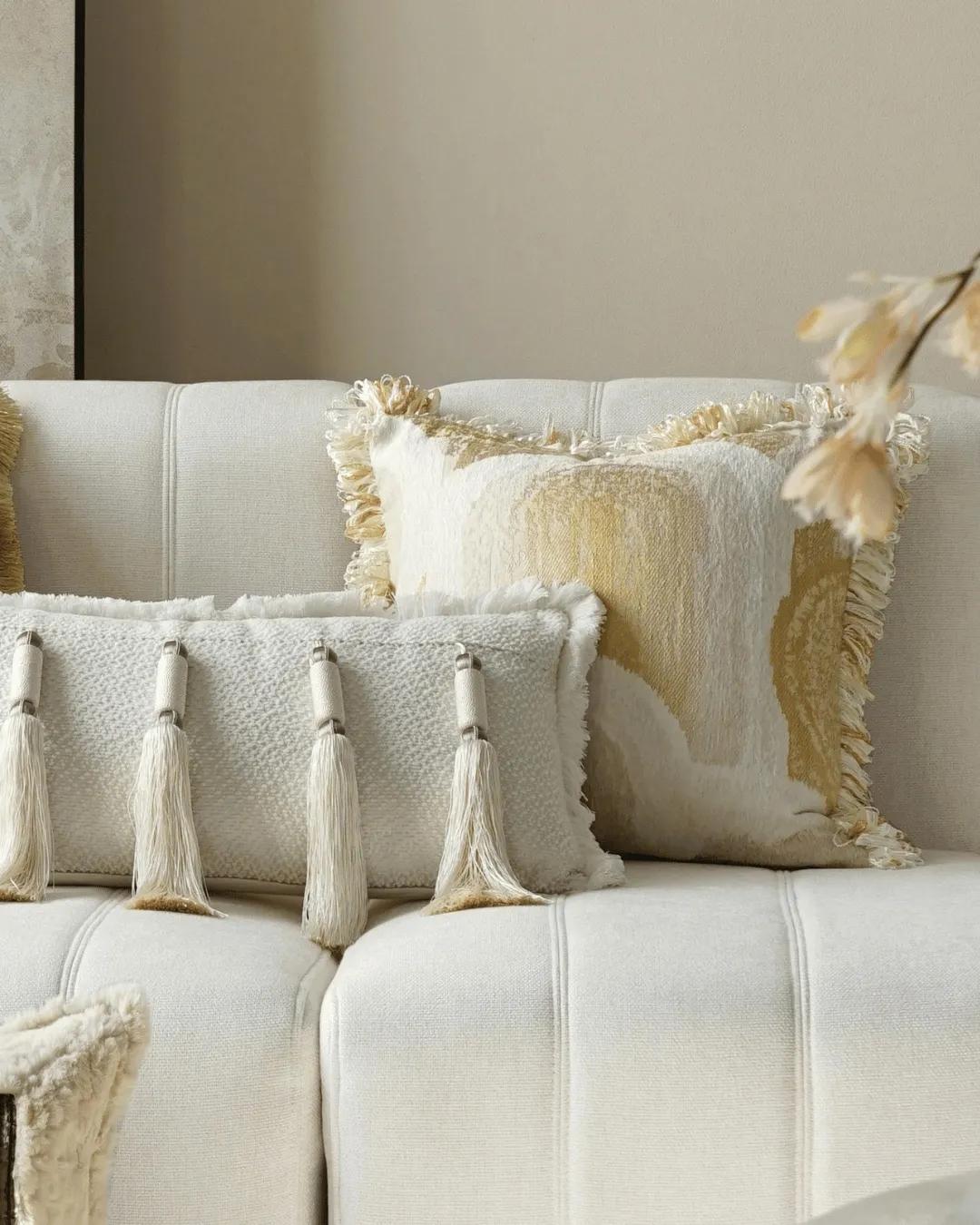
On the sofa: one smooth solid cushion, one slubby linen, one structured (bouclé or embroidery) — same palette, three surfaces. Then a plush wool-blend throw over the arm for the soft-against-structured contrast.
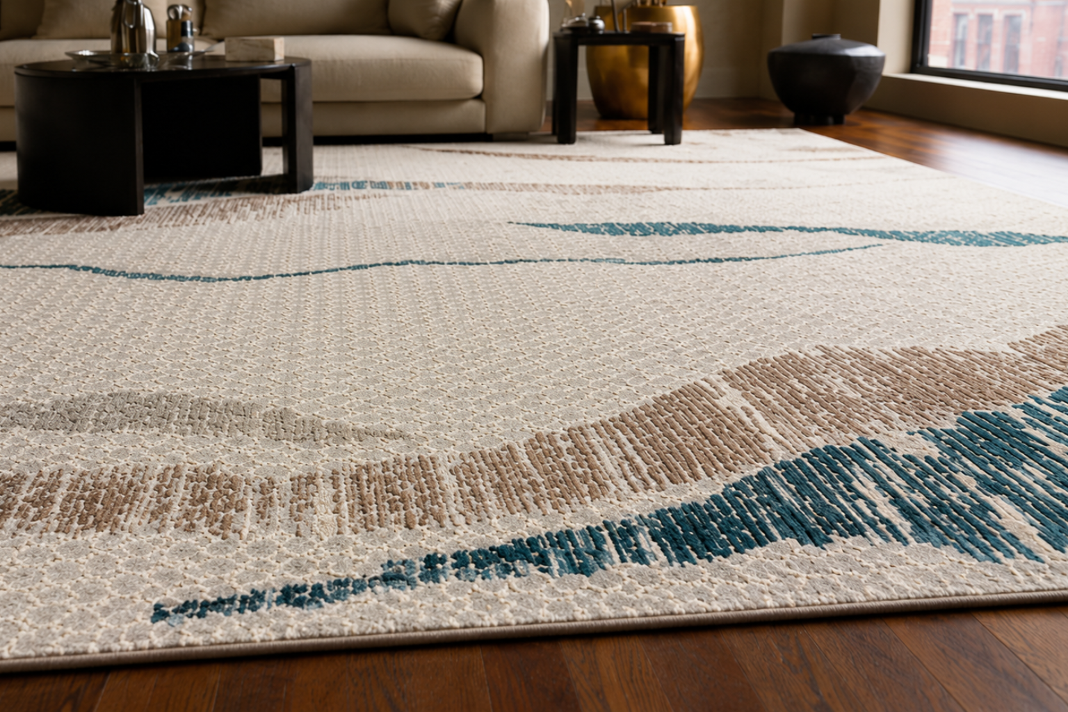
On the floor: a low-pile rug grounds the room; its tighter weave plays against the softer textiles above it.
On the bed: crisp cotton sheets (smooth), a slubby or waffle throw, and a knit or linen cushion — the same layering logic as the sofa.
Keep the colour quiet so the texture reads
The trick only works if the palette stays disciplined. If you layer lots of texture and lots of colour, the room turns busy and the texture is lost in the noise. Keep the colours close — tonal oats, stones and creams — and let the surfaces provide all the variety. The more restrained the palette, the more each texture earns its place.
A simple test
Stand back and ask: how many different surfaces can I see? If the honest answer is one or two, the room will feel flat no matter how nice the colour. Add a slubby linen, a plush throw, a nubby weave — and watch a quiet room come to life without a single new colour.
This is the discipline behind SOISU's neutral pieces: slub linen, soft cotton, wool-blend, embroidery and bouclé, curated in honest materials so you can build the texture contrast that makes a calm Indian room feel layered and warm rather than bare.