Concepts · 6 min read · 03 Oct 2026
The 60-30-10 Rule with Textiles: One Palette for the Whole Home
The 60-30-10 rule splits a room's colour into a dominant 60%, a secondary 30% and a 10% accent. With textiles, walls and floors take the 60, sofa and rug the 30, and cushions and throws the 10.
By the SOISU studio
The 60-30-10 rule is a simple way to balance colour: about 60% of a room in one dominant colour, 30% in a secondary colour, and 10% in an accent. With textiles, the walls and large floor areas usually carry the 60, the sofa, curtains and rug carry the 30, and cushions, throws and small pieces carry the 10. Use the same three colours, in different proportions, across every room and the whole home starts to feel connected.
What the rule actually is
The 60-30-10 rule is a long-standing guideline used by interior designers, often explained with a menswear analogy: a suit (60), a shirt (30), a tie (10). The numbers are not meant to be measured. They describe a feeling of balance.
- 60% — dominant. The colour you see first and most. It sets the mood.
- 30% — secondary. Supports the dominant colour and adds depth. It should contrast enough to be noticed but not compete.
- 10% — accent. The spark. Small amounts, repeated, that draw the eye around the room.
It works because it gives a room a clear hierarchy. Rooms that feel "off" often have two colours fighting at 50/50, or five accents with nothing to hold them together.
Treat it as a common guideline rather than a law. Some rooms are better at 70-20-10, and very calm rooms can be almost entirely one colour family in different shades.
Mapping the rule to a real Indian room
Most Indian homes have fixed elements you cannot easily change: vitrified or marble floors, a painted wall, perhaps a wooden wardrobe or TV unit. Start there.
The 60 — the envelope
- Walls
- The floor, where it is visible
- Large built-in furniture, if it is a strong colour
The 30 — the big soft and hard pieces
- Sofa and main seating
- Curtains
- The main rug
- A bed's duvet cover or coverlet in the bedroom
The 10 — the accents
- Cushions
- Throws and bed runners
- Small rugs or mats
- Planters, vases, frames, lamps
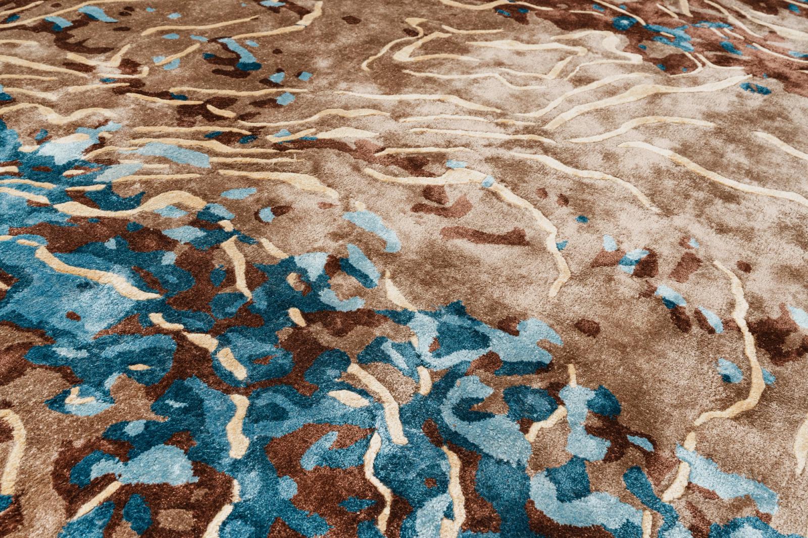
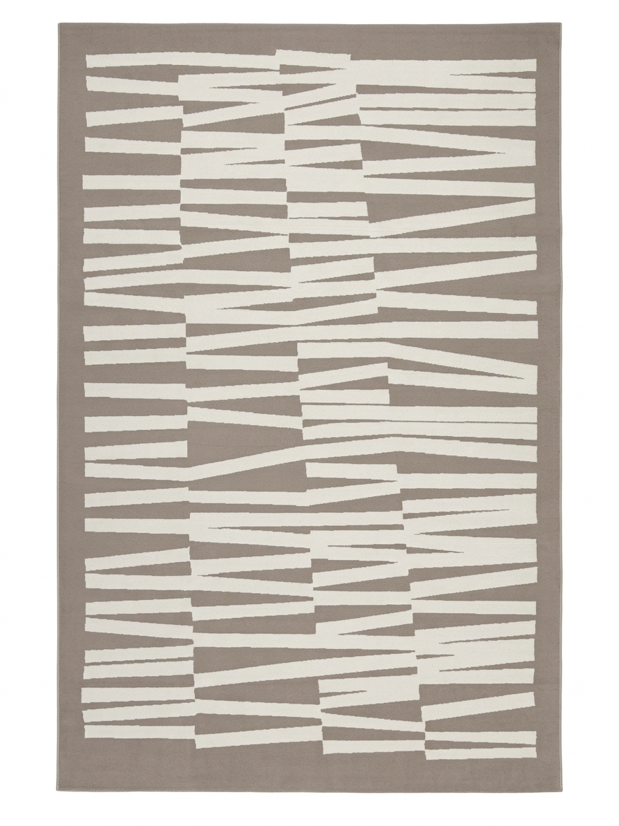
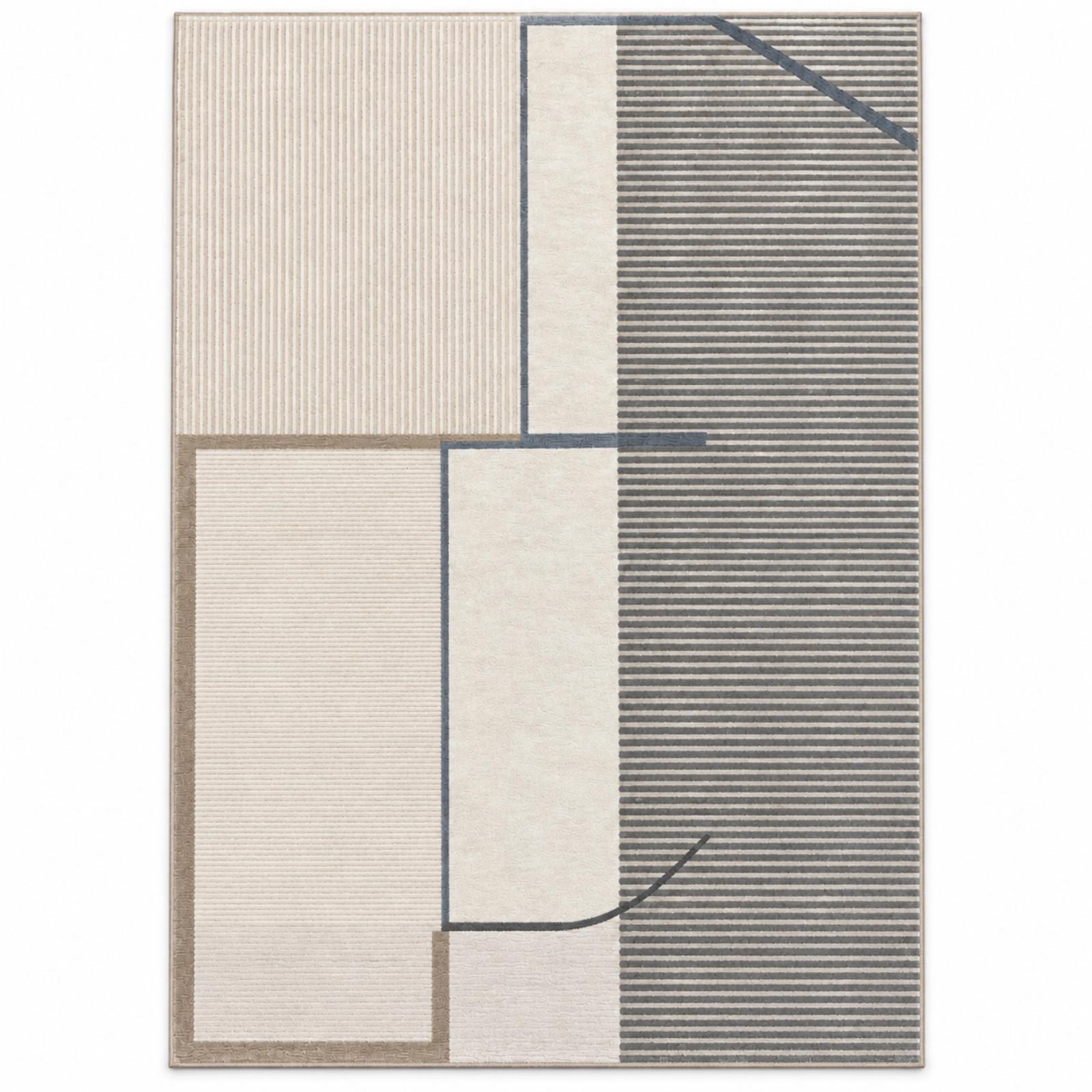
Notice where the rug sits. A large rug covers a big part of the floor, so it often belongs in the 30 with the sofa. A smaller rug with a strong colour can act as an accent. Deciding which job your rug does is one of the most useful choices in the room. See our rug size guide for how much floor a rug usually covers, and browse rugs in sizes from roughly 4 × 6 ft to 8 × 10 ft.
Worked example: a neutral living room
Say your walls are warm off-white and the floor is beige vitrified tile. That is your 60 — warm neutral.
- 30: A sand or oatmeal sofa is too close to the walls to count as a second colour. Instead choose a mid-tone for the secondary: a taupe-grey sofa, or a neutral sofa with a larger rust-and-ivory rug beneath.
- 10: Rust, repeated three times: two cushions, a throw, and a terracotta pot.
The trick is the repetition. An accent used once looks like a mistake. Used three times, spread around the room, it looks planned. Our guide to how many cushion colours to use goes further on this.
Three Indian palettes
These palettes are built around what many Indian homes already have — warm floors, strong light and wooden furniture.
- Sandstone and indigo — 60 (walls, floor): Warm ivory or sand — 30 (sofa, rug, curtains): Indigo or denim blue — 10 (cushions, throws, accents): Rust or terracotta — Suits: Living rooms with lots of daylight; coastal flats
- Haveli warmth — 60 (walls, floor): Soft cream — 30 (sofa, rug, curtains): Ochre, mustard or camel — 10 (cushions, throws, accents): Deep maroon or bottle green — Suits: Rooms with dark wood or heirloom furniture
- Monsoon calm — 60 (walls, floor): Pale grey-beige (greige) — 30 (sofa, rug, curtains): Sage or olive green — 10 (cushions, throws, accents): Charcoal or black, with brass — Suits: Bedrooms, compact flats, Japandi-leaning homes
A few notes:
- Sandstone and indigo is forgiving and fresh. Indigo hides everyday marks better than pale blue.
- Haveli warmth reads rich and festive but stays calm if the 60 is kept truly light.
- Monsoon calm is cooler and quieter. The charcoal accent gives it definition; the brass stops it going cold.
For more combinations, see colour palettes for Indian living rooms.
Carrying one palette through the home
The real payoff is room-to-room flow. In most Indian flats, you can see from the living room into the dining area, often into a bedroom and out to the balcony. If each space has its own unrelated scheme, the home feels choppy.
The simple method: keep the same three colours, but rotate their roles.
- Living room: ivory 60, indigo 30, rust 10.
- Dining area: ivory 60, rust 30 (a rug or table runner), indigo 10.
- Master bedroom: ivory 60, indigo 30 (duvet cover), rust 10 (cushions and a bed runner).
- Guest room: ivory 60, rust 30, indigo 10.
- Balcony: stone floor 60, indigo 30 (cushions), rust 10 (planters).
Each room feels different, but the home reads as one. This also makes textiles interchangeable. A cushion from the living room can move to the bedroom; a throw can move to the balcony for an evening.
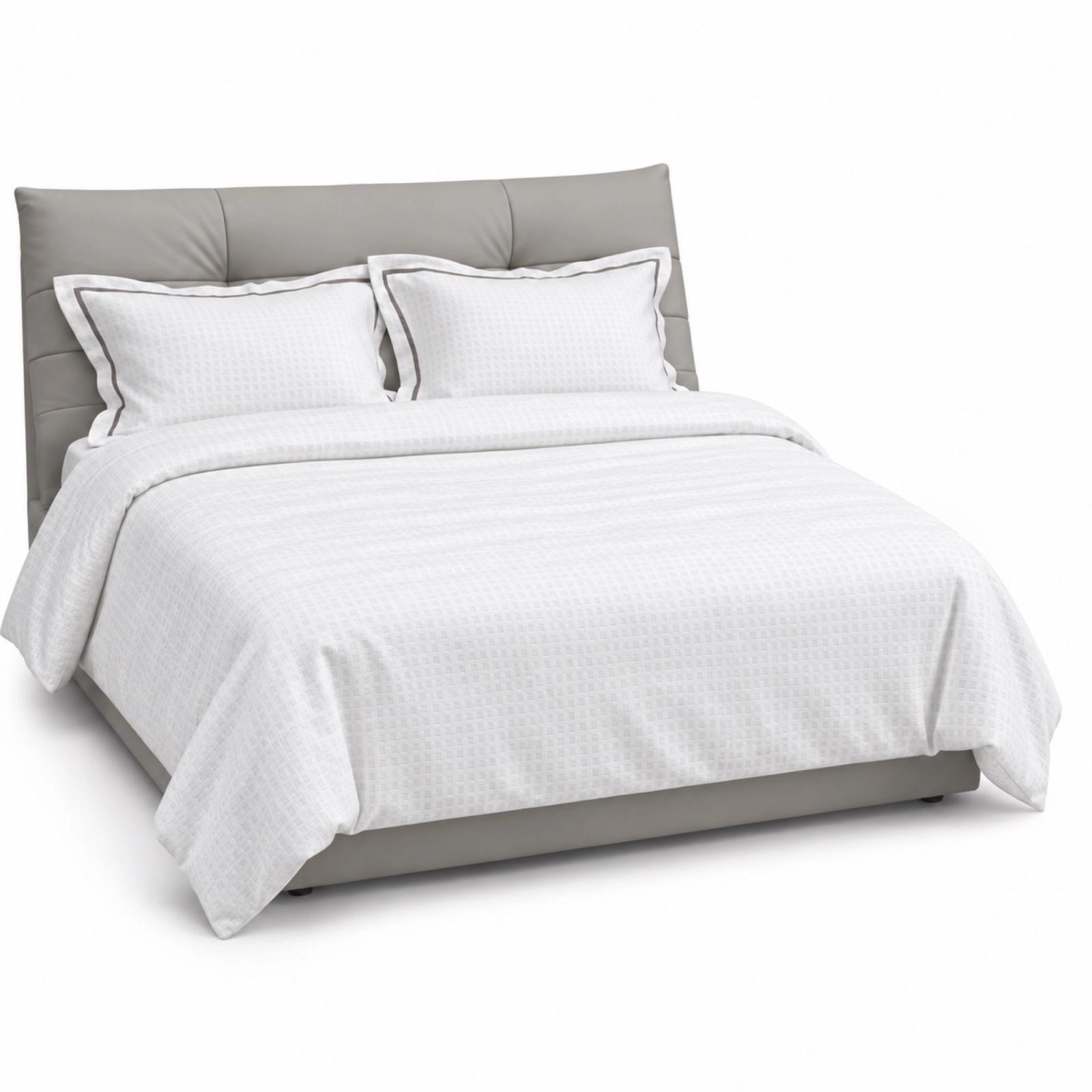
In bedrooms, bedding usually does the 30. A King-size duvet cover or coverlet is a large area of colour, so choose it with the room's 60 in mind, then accent with cushions and a runner. Our bedding sizes guide helps if you are unsure of fit.
When to break the rule
- Very small rooms. Going nearly all-neutral (80% plus) with tiny accents can make a small room feel bigger. See how to make a small room look bigger.
- Tonal rooms. A room in five shades of one colour, with texture doing the work, can be beautiful. Here the rule applies to light, medium and dark tones rather than to different colours.
- Pattern-heavy rooms. If your rug or a wall is heavily patterned, count the pattern's main colour as part of the 30 and keep the accent simple.
- Festive changes. For Diwali or a wedding at home, many people push the accent to 15–20% with extra cushions and runners. It works because it is temporary.
Getting started this weekend
- Stand in the doorway and name the colour you see most. That is your 60, whether you chose it or not.
- Pick a secondary colour that contrasts but does not shout.
- Pick one accent and plan where it appears three times.
- Write the three colours down and take the note shopping.
- Repeat the three colours, with roles swapped, in the next room.
If you prefer to start from a finished look, the Concept Shop shows complete room combinations with cushions, throws, bedding and rugs already balanced.
The short version
- 60% dominant (walls, floor), 30% secondary (sofa, rug, curtains, bedding), 10% accent (cushions, throws, small pieces).
- Decide whether your rug is part of the 30 or an accent; it changes the whole room.
- Repeat the accent at least three times so it looks planned.
- Use one three-colour palette for the whole home and rotate the roles room to room.
- Treat the numbers as a guide; small, tonal and festive rooms can bend them.