Concepts · 6 min read · 03 Oct 2026
Bedsheet and Wall Colour Combinations That Work
Pick bedding that either contrasts clearly with your wall or sits a few shades away from it in the same family, then add one accent cushion. Here are tested pairings for common Indian wall colours.
By the SOISU studio
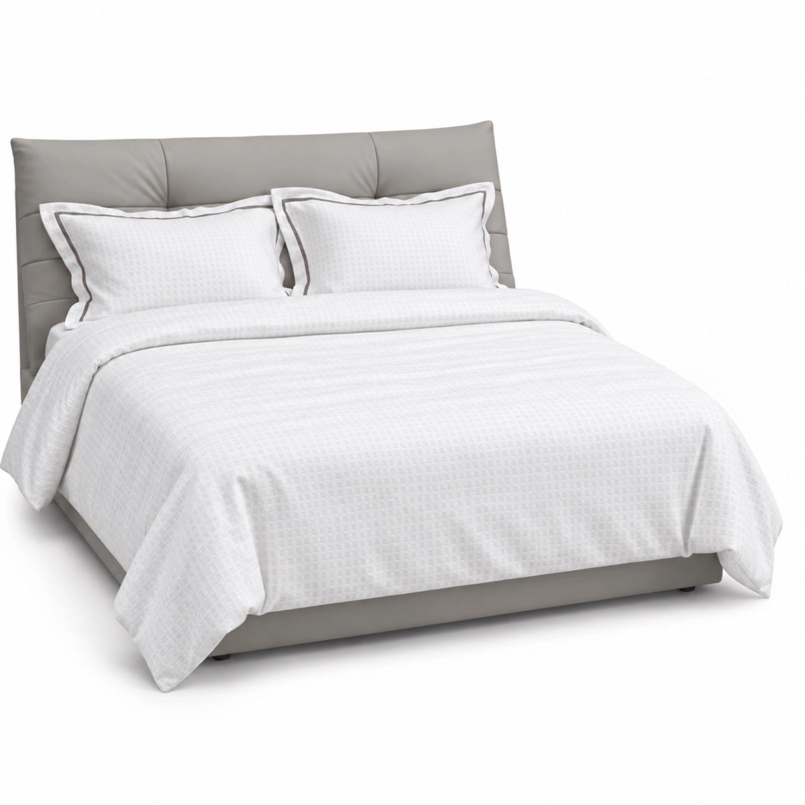
The bedding and wall combinations that work best do one of two things: they contrast clearly, or they stay in the same colour family a few shades apart. What rarely works is bedding that is almost, but not quite, the wall colour, because it looks like a mismatch rather than a choice. Decide which approach you want, choose bedding to suit, then add one accent colour through a cushion or runner.
Below is a practical way to decide, a table of pairings for the wall colours most common in Indian bedrooms, and notes on wood furniture, lighting and seasonal swaps.
Contrast or tonal: choose one approach
Contrast means the bed stands out clearly from the wall. Light bedding against a deep wall, such as ivory against navy or forest green, or deeper bedding against a pale wall, such as rust against off-white. Contrast makes the bed the focal point. It suits larger bedrooms and people who like a crisp, defined look.
Tonal means the bed and wall share a colour family but differ in depth. Oatmeal bedding against a warm beige wall, or pale sage against a muted green. Tonal rooms feel calm and enveloping, and they are forgiving in small rooms, where strong contrast can make the bed look heavy. This is the approach behind Japandi style and most quiet, restful bedrooms.
A useful test: squint at the room from the doorway. In a contrast scheme, you should see the bed as a clear shape. In a tonal scheme, you should see a soft gradient. If you see neither, the colours are fighting.
Wall colour to bedding: pairings that work
These are starting points, not rules. The accent column is where one cushion, a lumbar or a runner brings the scheme to life.
- White or off-white — Bedding colours that work: Ivory, oatmeal, soft grey, or deeper rust and olive for contrast — Accent cushion or runner: Terracotta, ochre or indigo
- Warm beige or cream — Bedding colours that work: Oatmeal, taupe, warm white, camel — Accent cushion or runner: Rust, burnt orange or deep olive
- Light grey — Bedding colours that work: White, charcoal, dusty blue, blush — Accent cushion or runner: Mustard or deep teal
- Sage or muted green — Bedding colours that work: Ivory, oatmeal, pale sage, soft pink — Accent cushion or runner: Terracotta or plum
- Navy or deep blue — Bedding colours that work: White, ivory, pale grey, camel — Accent cushion or runner: Mustard, ochre or rust
- Terracotta or clay — Bedding colours that work: Ivory, sand, warm white, olive — Accent cushion or runner: Deep green or indigo
- Dusty pink or blush — Bedding colours that work: Ivory, grey, pale green — Accent cushion or runner: Burgundy or olive
- Deep green or teal — Bedding colours that work: Ivory, camel, blush, oatmeal — Accent cushion or runner: Brass-yellow or rust
A few patterns run through this table. Ivory and oatmeal work with almost any wall, which is why they are the safest base. Warm walls, such as beige, terracotta and clay, are usually happiest with warm neutrals and earthy accents. Cool walls, such as grey, blue and most greens, can take either warm or cool bedding, but a warm accent stops them feeling cold.
Our bedding collection is King size, with duvet cover sets and coverlets. For the accent, cushion covers in 45 × 45 cm or the 30 × 45 cm lumbar are the easiest way to test a colour before committing to more of it.
How many colours on the bed
A simple structure keeps things calm:
- Base colour (about 70 percent of what you see): the duvet or coverlet.
- Supporting colour (about 20 percent): pillows, the top sheet fold, or a second neutral.
- Accent (about 10 percent): one lumbar, two squares, or a runner.
That is a common proportion used by stylists, not a formula, but it stops the bed from becoming busy. If the wall itself is a strong colour, count it as one of your three. For more on combining cushion colours, see the cushion colour pairing FAQ.
Wood furniture changes everything
In most Indian bedrooms the bed frame, wardrobe and side tables are wood or wood-finish laminate. That wood is a colour too, and often a large one.
- Honey, teak and golden wood. These are warm and slightly orange. They look best with warm whites, oatmeal, olive, rust and deep blue. Cool greys and icy whites can look flat next to them.
- Walnut and dark brown. Rich and heavy. Lighten the room with ivory or pale sage bedding, and pick up the depth with a rust, ochre or deep green accent.
- Light oak, ash and white-washed wood. Calm and Scandinavian in feel. Soft greys, pale blues, sage and warm whites all suit. A charcoal or navy accent adds weight.
- Mixed woods. Common in homes with inherited furniture. Pick bedding that sits between the tones, often oatmeal or taupe, so the woods read as a family rather than a clash.
If your headboard is upholstered, treat it as part of the wall for contrast purposes.
Lighting: check the combination in your own light
Bedding looks different in your bedroom than it does on a screen or in a shop. Warm bulbs, which most bedrooms use in the evening, push colours towards yellow. Whites look creamier, greys look warmer, and blues can look slightly green. Cool light does the opposite.
Two practical steps:
- Check any new colour in the room at the times you actually use it, usually morning daylight and evening lamp light.
- If your wall is a warm off-white and your bulbs are warm, a cool bright white duvet may look slightly blue next to it. A warm white or ivory will sit better.
North-facing rooms get cooler, softer daylight, and warm bedding helps them feel comfortable. South- and west-facing rooms get stronger, warmer light, where cooler or paler bedding can feel fresher in the summer months.
Seasonal swaps without repainting
The wall stays; the bed can change. A few easy switches:
- Summer: lighter coverlet, paler tones, crisp white or pale blue. Keep only the lumbar as an accent.
- Monsoon: mid-tones that hide the odd mark and damp-weather dullness, such as sage, taupe or grey-green. Keep bedding well aired.
- Winter: heavier duvet, deeper colours, and a textured throw or runner across the foot of the bed.
- Festive season: bring in richer accents, such as marigold, deep red, emerald or plum, through cushions and the runner, and keep the base neutral so it stays calm.
The cheapest swap is always the accent. Change two cushion covers and a runner, and the same wall and duvet can move from summer to Diwali. For a broader view of colour across the home, our guide to colour palettes for Indian living rooms uses the same principles. To see complete bedroom schemes, browse the Concept Shop.
The short version
- Choose contrast (bed stands out) or tonal (same family, different depth). Avoid bedding that is nearly, but not quite, the wall colour.
- Ivory and oatmeal work with almost any wall. Add one accent through cushions or a runner.
- Factor in your wood furniture. Warm woods prefer warm neutrals; light woods suit cooler, softer tones.
- Check colours in your own daylight and evening light before deciding.
- Swap accents with the season rather than repainting.