Material · 7 min read · 03 Oct 2026
How to Tell a Premium Cushion Cover from a Cheap One
A premium cushion cover shows itself in fabric weight, weave density, matched patterns at the seams, a hidden zip and neat piping. Here is a ten-point checklist to use in a shop or on delivery.
By the SOISU studio
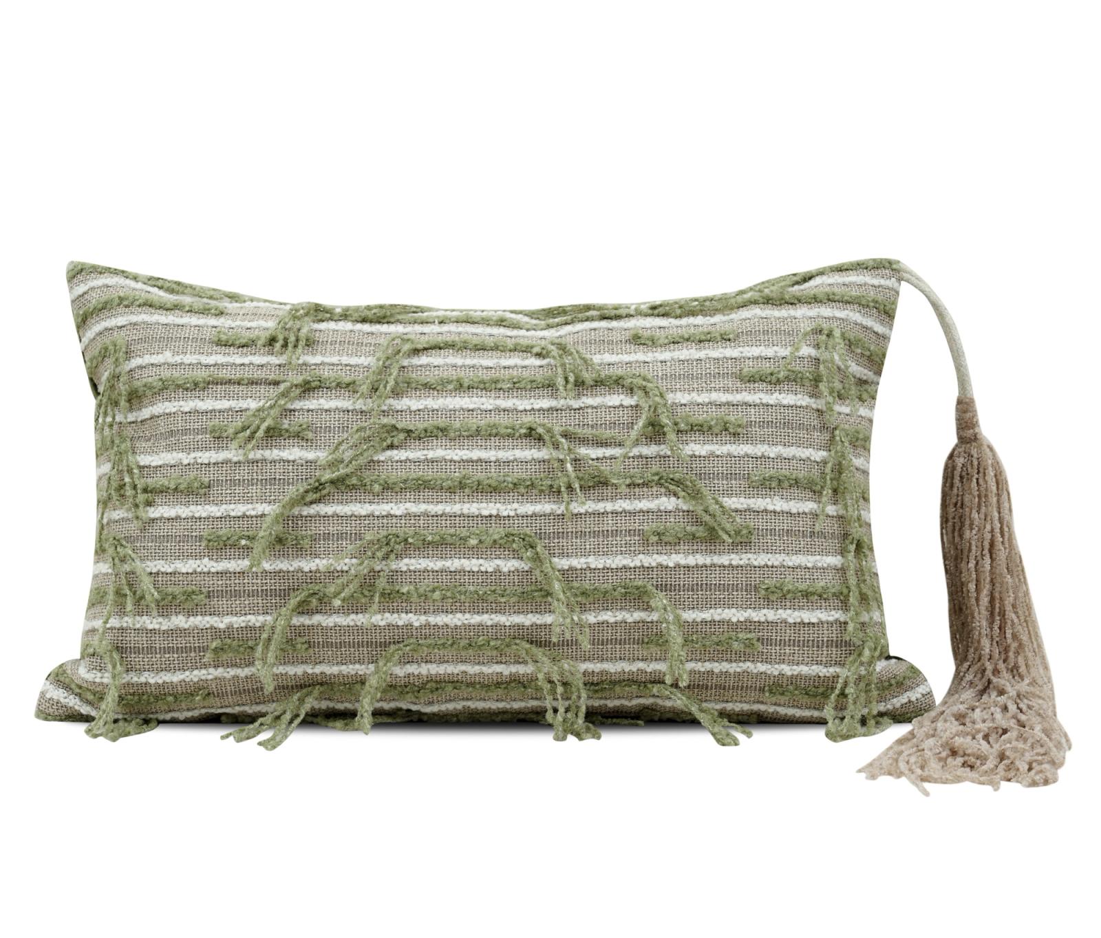
You can tell a premium cushion cover from a cheap one in under two minutes by checking five things: how the fabric feels and hangs, how dense the weave is, whether the pattern lines up at the seams, where and how the zip is fitted, and how the edges are finished. Price and product photos tell you very little. Construction tells you almost everything.
This is a general buyer's checklist, useful whichever brand you buy from. Use it in a shop, or when a parcel arrives and you still have time to decide.
Feel the fabric: weight, hand and weave
1. Fabric weight and hand
"Hand" is the trade word for how a fabric feels. Pick up the cover and let it drape over your palm.
- Premium: it has some body. It falls in soft folds rather than collapsing flat, and it feels even across the whole panel.
- Cheap: it feels papery, stiff with finishing chemicals, or so thin it clings to your hand.
Heavier is not always better. A fine, tightly woven fabric can be light and still premium. What you are checking is substance and evenness, not bulk. Rub a corner between finger and thumb; if it feels coated or squeaky, the softness may wash out.
2. Weave density
Hold the cover up to a window or a phone torch.
- A dense weave lets through a soft, even glow.
- A loose weave shows pinpoints of light and gaps between threads.
Loose weaves snag more easily on bangles, watches and pet claws, and they let insert fibres work their way through over time. In dusty Indian cities, a denser weave also holds up better to frequent shaking and brushing. Textured weaves such as bouclé or slub fabrics are meant to look irregular, so judge those on firmness rather than on even light.
Check the cut: pattern alignment
3. Pattern alignment at the seams
This is the quickest tell of care in cutting.
- On stripes, checks and ikats, look at where the front and back panels meet at the sides. On a well-made cover, the lines meet or continue in a deliberate way.
- On a large motif, the design should sit centred on the front, not drift off to one side.
- On a woven jacquard, the pattern should run straight, not skew diagonally across the panel.
Matching patterns uses more fabric and more cutting time. Makers who skip it are usually saving elsewhere too.
Check the finish: zip, piping and seams
4. Zip quality and placement
Turn the cover over and find the closure.
- Placement: a concealed zip set into the bottom seam is the neatest option. A zip across the middle of the back panel is common on cheaper covers and can show when the cushion turns.
- Length: the zip should run most of the width of the cover. A short zip makes inserting a full, plump insert difficult and strains the seam.
- Action: it should glide without catching. Check that the pull is metal or solid, and that the tape is stitched straight.
- Cover flap: a small fabric flap over the zip protects skin and upholstery.
Envelope backs without zips are fine on some styles, but the overlap should be generous so the insert does not show.
5. Piping and edge finish
Piping is the corded trim that runs around the edge of some covers. It is not required, but when it is there, it should be done well.
- The piping should be straight, evenly filled and without puckers at the corners.
- Corners should be crisp or gently rounded, not bunched.
- On unpiped covers, the seam should sit exactly on the edge and not roll to the front.
Check the four corners especially. Rushed sewing shows there first.
6. Seam allowance and stitching
Turn the cover inside out. This is where cheap covers give themselves away.
- Seam allowance: look for a reasonable margin of fabric beyond the stitch line, roughly a centimetre or so. A tiny allowance can pull apart when a full insert stretches the seam.
- Edge finishing: raw edges should be overlocked or otherwise neatened so they do not fray in the wash.
- Stitch length: small, even stitches are stronger than long, loose ones. Tug gently at a seam; it should not gape.
- Hand — Premium sign: Even, some body, drapes softly — Cheap sign: Papery, coated or limp
- Weave — Premium sign: Even glow against light — Cheap sign: Visible gaps
- Pattern — Premium sign: Centred and matched at seams — Cheap sign: Off-centre, broken lines
- Zip — Premium sign: Concealed, long, smooth — Cheap sign: Short, exposed, catching
- Seams — Premium sign: Generous, overlocked, even — Cheap sign: Narrow, raw, loose stitches
Test at home: colour and fit
7. Colourfastness test
Deep colours, especially indigo, maroon, emerald and black, can bleed. Before the first wash, do a simple test at home.
- Dampen a white cotton cloth or tissue.
- Press it firmly onto an inside seam of the cover for a few seconds.
- If colour transfers noticeably, wash the cover separately in cold water the first few times.
Also check for fading on folds of a display piece. In Indian homes with strong afternoon sun, colour stability matters as much as the first impression. Our guide on how to wash cushion covers covers the rest.
8. Insert fit
A premium cover can look cheap on a flat insert, and a decent cover can look expensive on a full one.
- The cover should close without straining the zip.
- Corners should fill out, not flop.
- A common styling guideline is an insert one size larger than the cover, for example a 20 × 20 in insert in an 18 × 18 in cover.
For standard cover and insert sizes, see sizes and measurements in India.
Where to spend and where to save
You do not need every cushion to be top quality. Spend on the two or three front cushions that people touch and see most. Save on back layers that are mostly visual. Mixing a few strong textures with quieter, simpler covers also reads as more considered than a matching set; see how to layer textures in a room.
When you browse cushion covers online, ask for close-up photos of seams and zips if they are not shown. At SOISU, a QC photo is available on request before dispatch, so you can see the piece that will be sent. For colour decisions, the cushion colour pairing hub is a good next step.
The short version
- Judge construction, not price: fabric hand, weave density, seams, zip and edges.
- Hold the cover to light; even density means better wear and fewer snags.
- Look for matched patterns and a long, concealed zip in the bottom seam.
- Turn it inside out: generous, overlocked seams are the clearest sign of care.
- Test deep colours for bleed before the first wash, and use a slightly larger insert.