Concepts · 6 min read · 03 Oct 2026
Warm vs Cool Light: Why Your Cushions Look Different at Home
Cushions change colour at home because your bulbs and daylight differ from a studio or screen. Warm light pushes fabrics yellow; cool light pushes them blue. Here is how to test and choose bulbs.
By the SOISU studio
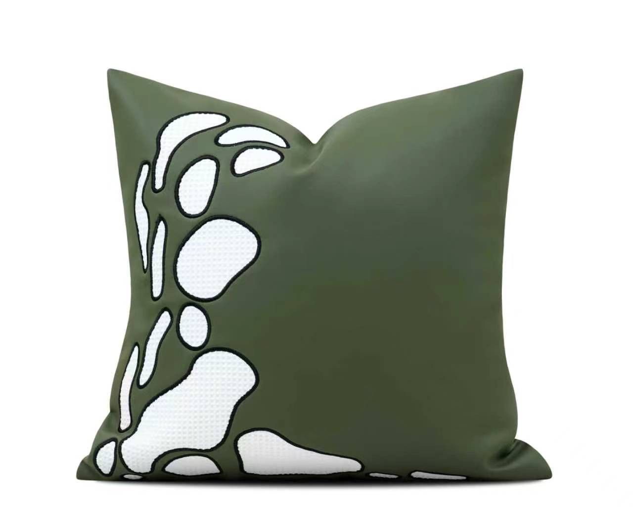
Your cushions look different at home because the light in your room is different from the light they were photographed or displayed in. Warm bulbs add yellow and orange, so blues turn greenish and whites turn cream. Cool bulbs add blue, so warm colours like rust and ochre look duller. Fabric also absorbs and reflects light differently from a screen, which adds a second shift on top.
None of this means the product is wrong. It means colour depends on light, and a little understanding helps you choose well and set up your room so textiles look their best.
Kelvin, simply explained
Light colour is measured in kelvin, written K. You will find it on most LED bulb boxes. The scale runs the opposite way to what you might expect: lower numbers are warmer and more yellow, higher numbers are cooler and more blue.
- 2700K — Common label: Warm white — What it feels like: Candle-like, cosy, evening — Effect on fabric colours: Whites turn cream; reds, rusts and golds glow; blues and greys shift warm
- 3000K — Common label: Soft or warm white — What it feels like: Warm but a little cleaner — Effect on fabric colours: Similar, slightly less yellow; a good middle for living rooms
- 4000K — Common label: Neutral or natural white — What it feels like: Clear, fresh, close to mid-morning daylight — Effect on fabric colours: Colours look closest to "true"; whites stay white
- 5000–6500K — Common label: Cool white or daylight — What it feels like: Bright, bluish, office-like — Effect on fabric colours: Blues and greys look crisp; warm colours can look flat or grey
In many Indian homes, tube lights and ceiling panels are cool daylight, while table lamps and bedroom bulbs are warm. That mix is one reason a cushion can look like two different colours in the same room.
Which colours shift the most
Some colours hold steady. Others move a lot.
- Whites and ivories. Very sensitive. Under warm light, a bright white looks cream and an ivory looks yellow. Under cool light, ivory can look slightly grey.
- Greys and greiges. Greys pick up whatever tint the light has. A cool grey can look almost blue under daylight bulbs and warm taupe under lamp light.
- Blues and teals. Warm light pulls them towards green. Navy can look almost black in the evening.
- Greens. Sage and olive swing between grey-green and yellow-green depending on the bulb.
- Warm colours: rust, terracotta, mustard, ochre, marigold. These look rich under warm light and can go muddy or brown under cool daylight bulbs.
- Pinks and blush. Warm light makes them peachy; cool light can make them look lilac.
- Deep, saturated colours like emerald or burgundy. Generally more stable, though they darken noticeably in dim light.
Texture matters too. Fabrics with a pile or sheen, such as velvet-style weaves, change colour as you move around them, because light catches the fibres at different angles. Flat, matte weaves change less. Our guide to layering textures in a room touches on how this plays out across a sofa or bed.
Daylight changes by room facing
Daylight is not one colour either. In India, which lies in the northern hemisphere, the direction a room faces changes both the strength and the tone of its light.
- North-facing rooms get steady, indirect light with no harsh sun. It tends to look cooler and softer. Warm colours help these rooms feel comfortable; cool greys can feel chilly.
- South-facing rooms get strong light for much of the day, especially in winter. Colours look bright and can wash out at midday. Mid-tones and deeper shades hold up better than very pale ones.
- East-facing rooms are bright and fresh in the morning and cooler later. Check colours in the afternoon as well as the morning.
- West-facing rooms are softer in the morning and get warm, intense, often harsh sun in the late afternoon. Oranges and reds glow at sunset; pale colours can look yellow.
Add the harsh summer sun, sheer or heavy curtains, and nearby buildings or trees, and every room has its own light. Sun can also fade fabrics over time, so it helps to rotate cushions that sit in direct window light.
How to test a swatch or product at home
The only reliable test is in your own room, in your own light.
- Check at three times of day. Morning daylight, bright afternoon, and evening with your usual lamps on. Many colour disappointments only appear after dark.
- Place it where it will live. Put the cushion on the actual sofa or bed, not on a table by the window. The colours around it change how you see it.
- Compare against something white. Hold a plain white sheet of paper next to the fabric. If the paper looks yellow, your light is warm, and the fabric is shifting the same way.
- Look from where you sit. Colour looks different up close and from across the room. Judge from your usual seat or the doorway.
- Avoid judging on a phone screen alone. Phone cameras auto-correct colour, so a photo taken at home may not match what your eye sees. Use it only for side-by-side comparisons taken in the same light.
When you shop online, look at several photographs of the same product, as they are often taken in different light. SOISU can share a QC photo on request before dispatch, which is a useful extra reference. Our cushion covers, rugs and bedding are best judged once they are in the room, next to your wall and upholstery.
Choosing bulbs for textile-rich rooms
If your living room or bedroom has a lot of fabric, such as cushions, curtains, a rug and a throw, lighting choices matter more than usual.
- Pick one colour temperature per room. Mixing a cool ceiling panel with warm lamps makes textiles look inconsistent. For living rooms and bedrooms, 2700K to 3000K suits evenings; 4000K suits rooms used mostly for work or reading.
- Look for a high CRI. CRI, the colour rendering index, describes how faithfully a bulb shows colours compared with natural light. It is often printed on the box. For rooms where fabric colour matters, a CRI of 90 or above is a common recommendation.
- Layer your light. Use a ceiling light for general light, and lamps at seating height. Lower, side-lit light shows off the texture of weaves far better than a single overhead source.
- Consider tunable bulbs. Some LED bulbs let you shift from warm to neutral. They are useful if a room is used differently by day and night.
- Use dimmers where you can. A warm bulb at full brightness can look harsh. Dimmed, it flatters both people and fabric.
If you are building a colour scheme from scratch, choose your bulbs first, then choose textiles under them. Our guides to colour palettes for Indian living rooms and cushion colour pairing are easier to apply once the light is settled.
Planning around the shift
Rather than fighting the light, use it. In a room lit mostly by warm lamps, lean into colours that glow under warm light, such as rust, ochre, olive and warm neutrals. In a cool, bright room, blues, greys, sage and crisp whites look their best. If you want a scheme that looks consistent from morning to night, choose mid-tones and colours that sit between warm and cool, such as taupe, clay or muted green.
For finished room looks that show how colours sit together, browse the Concept Shop.
The short version
- Lower kelvin (2700–3000K) is warm and yellow; higher kelvin (5000–6500K) is cool and blue. 4000K is close to neutral.
- Whites, greys, blues and greens shift the most. Deep saturated colours shift the least.
- Room facing changes daylight: north is cool and soft, west is warm and harsh in the late afternoon.
- Test fabric at home in morning, afternoon and evening light, in the spot where it will actually sit.
- For textile-rich rooms, use one colour temperature per room and look for bulbs with a CRI of 90 or above.